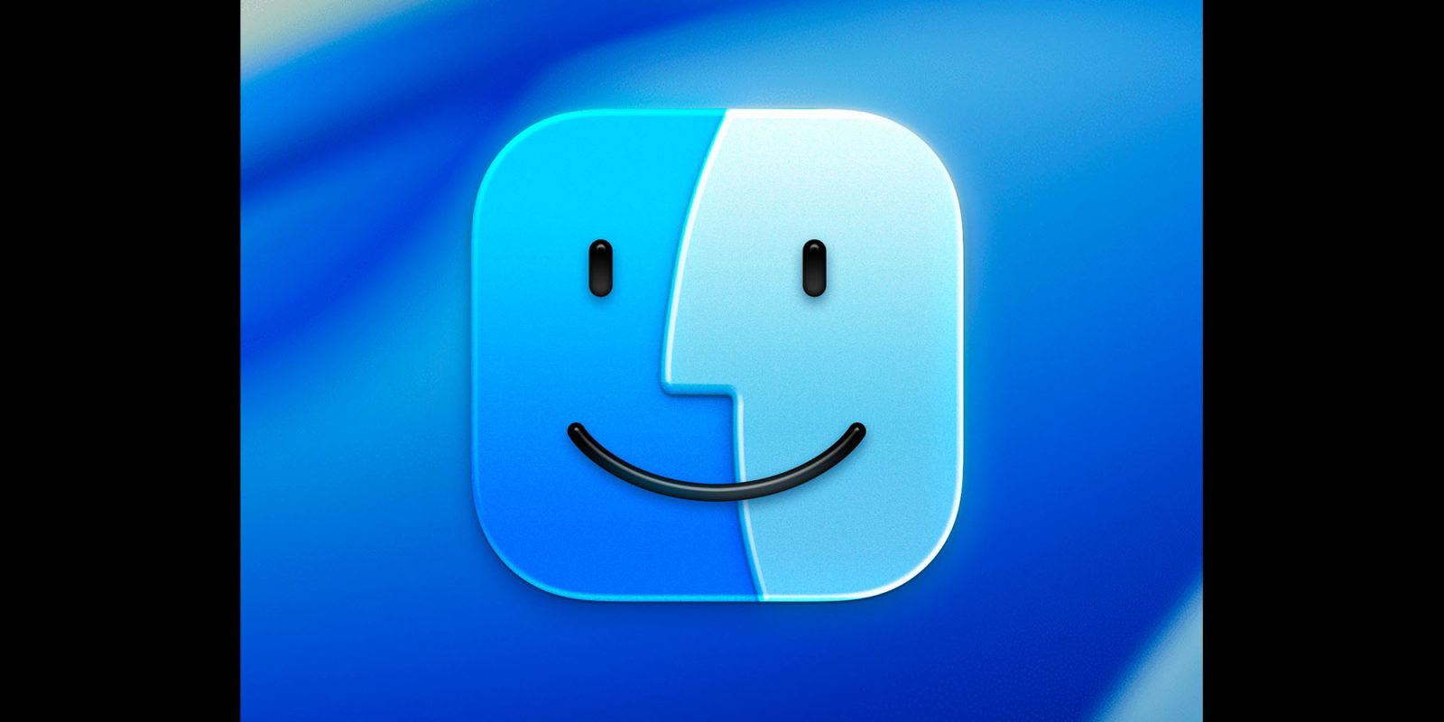
The new Finder icon in the first beta of macOS Tahoe 26 raised a lot of eyebrows when Apple did more than glassify it: the company also flipped the light and dark sides.
The internet wasn’t happy, and beta 2 saw the natural order of things restored – but many still think Apple has lost sight of an essential element, and one designer has put it right …