![]()
In System Settings ➝ Appearance, there are still the standard Auto, Light, and Dark modes, but Apple has added several options that allow you to really mix things up and create your own stylized desktop environment.
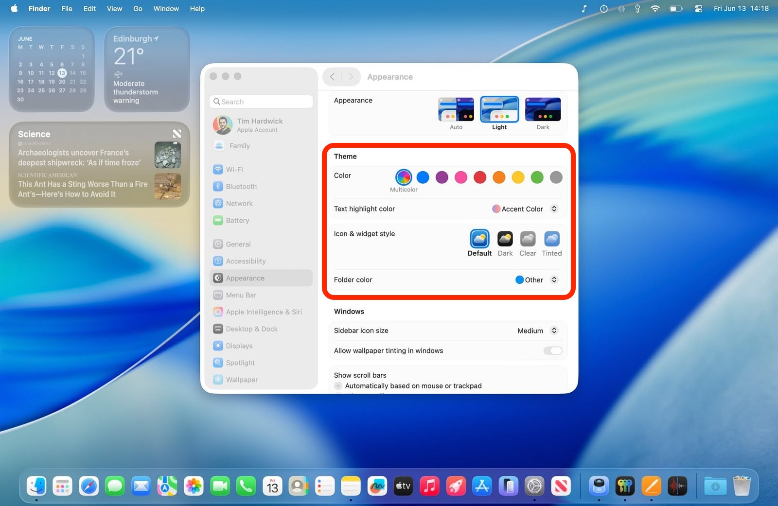
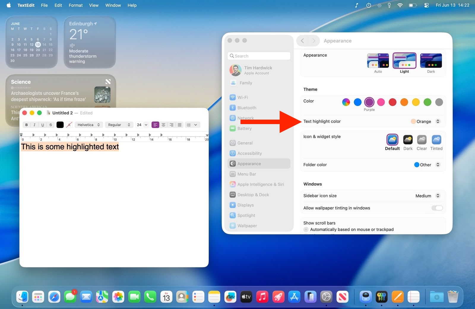
“Accent color” has become “Color,” and there’s a new “Text highlight color” option, so you can now make highlighted text appear in a different shade to buttons, pop‑up menus, radio buttons, checkboxes, and focused outlines.
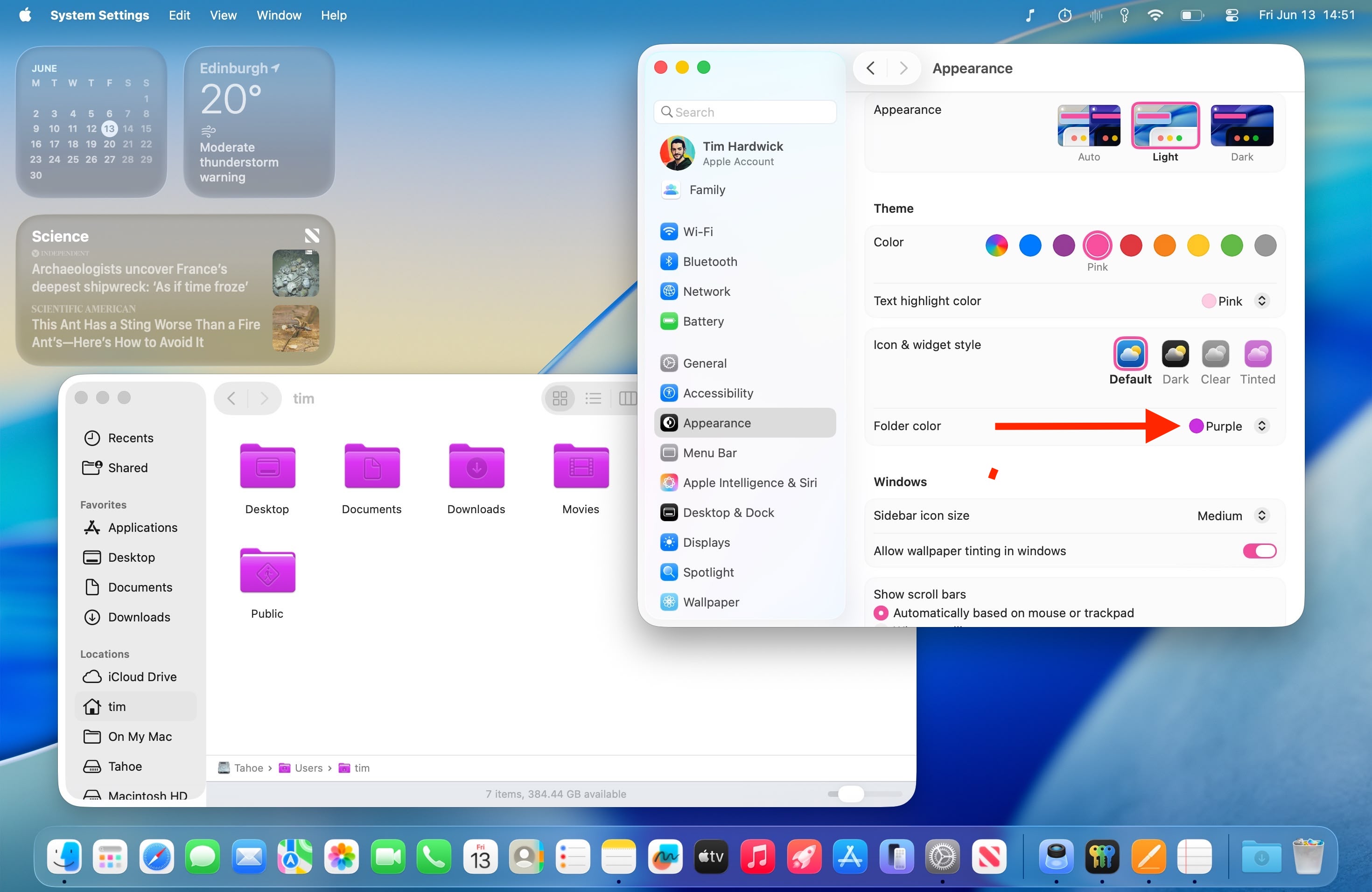
The default setting maintains the classic macOS look with app icons displaying their original colors. However, you can now customize folder colors through a dedicated new “Folder Color” setting. When set to Automatic, folders retain their traditional blue appearance, but switching to other colors like red will change all folder colors system-wide.
Meanwhile, a new “Icon & widget style” section offers three distinct modes alongside the Default. Like iOS 18, the new Dark option applies black backgrounds to icons throughout the system interface, including System Settings sidebar icons (this works in both Light and Dark modes). You can set this to Always or Automatic, which switches to dark icons at night while maintaining the default appearance during daylight hours.
![]()
The new Clear setting emphasizes the Liquid Glass redesign and adds a new transparency by picking up background colors, creating a more translucent interface effect. Clear also includes Light and Dark variants, or it can be set to Auto for automatic day-night switching.
![]()
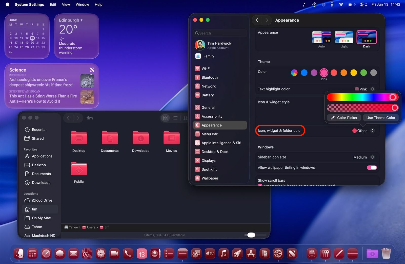
Most notably, the Tinted option allows comprehensive color customization of both icons and folders. With “Tinted” selected, the Folder color setting becomes “Icon, widget & folder color,” allowing you to select from preset colors or choose custom tints using the Other option (which includes a color picker and a theme color). Tinted mode can also be configured as Light or Dark for a more subdued appearance or set to Auto for time-based switching.
Overall, the new Theme enhancements ensure “personalization parity” between macOS and iOS. Apple is offering unprecedented control over your desktop’s visual appearance, but you still get system-wide consistency across interface elements. For added visual customization, you can even can add a symbol or emoji to folders for a unique flair. What do you think of the new Theme options in macOS 26? Let us know in the comments.
This article, “macOS Tahoe’s New Theming System Explained” first appeared on MacRumors.com
Discuss this article in our forums