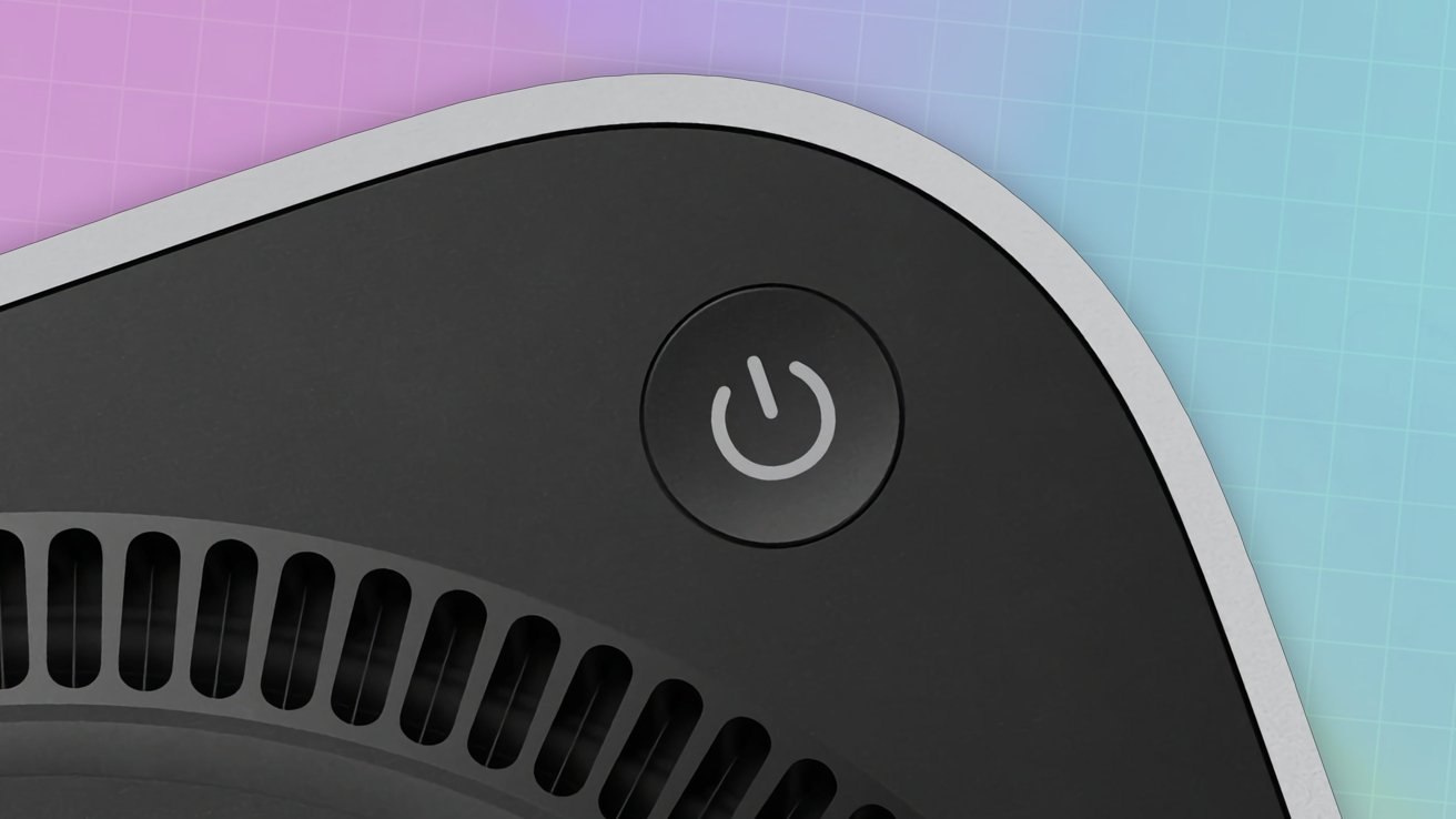
Apple’s decision to place the power button of the M4 Mac mini underneath has been questioned by users. In some cases, they’ve come up with their own “solutions” to the problem.

Mac mini power button

Mac mini power button
The introduction of the M4 Mac mini was welcomed by critics, with the already small Mac made to be even smaller. Getting to that size meant there had to be a compromise, and that took the form of an awkward power button placement.
Rather than at the rear, the button is instead underneath the corner of the Mac mini’s enclosure. It’s in a position that you have to lift or tilt the Mac mini to access it, which can be awkward for people with larger digits.